

Movie Time App
Context:
The first project in the Google UX Design course gave the prompt of creating a user flow to order snacks before a movie. Today, people usually buy tickets online ahead of the movie time, and movie-goers should be able to order snacks ahead of time in the same way.
Challenge:
Snacks are a part of the movie going experience and no one wants to not be able to get snacks, because they are late and don't want to miss the trailers of the beginning of the movie.
Solution:
Create an app that would allow users to order food before arriving at the movie theater. This will make the movie-going experience easier and more enjoyable.
Scope: Google UX Design Course
Duration: Two weeks
Tools: Figma
Role: Concept, Wireframe, Prototype, User Research
Wireframes
My first thought with this app was to not only make sure that a user could order from it, but that they would be able to also find the location of the theater, look at movies, and buy tickets. I also wanted them to be able to create a profile to earn rewards (since we all know the movies have gotten quite expensive).
Design Process


Lo-Fi Screen Flow
Once I started to create the user flow I decided to focus on the prompt which was to be able to order food. I also made sure to add lots of imagery so people would know exactly what they were choosing. I have on few occasions messed up the location of where I wanted to go, so I made sure the user could check on the location of where their order was placed and find directions.

Usability Testing
User Personas
These personas were created from interviewing real people. One of them a working, mother of four who takes her kids for entertainment and an easy activity. The other, a teenager who wants to enjoy the movies with their friends.


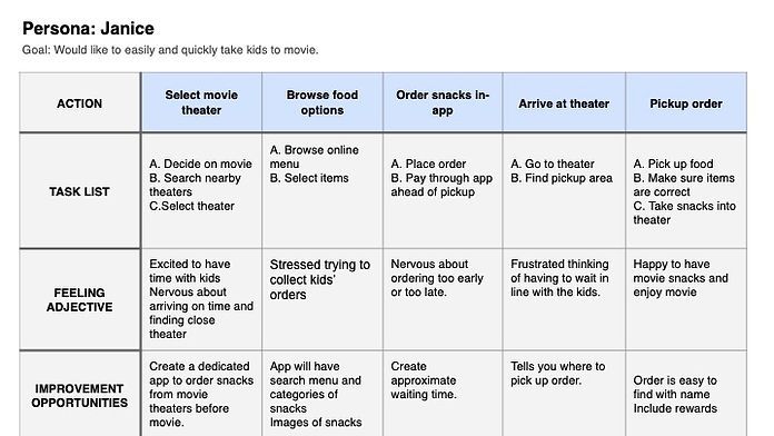
User Journey
This user journey explains the actions in which a person might take when ordering food at a movie theater.
Competitive Audit
I complied a list of businesses that offer similar services. I did this as a way of seeing what I could improve in my own design and how I could make it work best.

Research Study
This research study outlines the actions and questions that shall be asked to research participants. The prompts were written out carefully so users would be able to give their honest opinions of the design.


Usability Study
This usability study outlines tasks and observations from users testing the design. There were multiple parts of the design that could be improved on after giving this usability study including: a map link, quick cart add, and credit card scanner.

Final Iteration

This is the final iteration of the hi-fidelity prototype. I made changes to the original wireframe design that includes a better layout and navigation, as well as more options for easier payment, and the ability to track what time the order will be ready. I also included the movie theater colors of red and black in order to connect the movie going experience with this design.
